Redesigning the Offer View Experience
Aligning product reality with CLARK's promise of choice and trust.
- Role
- Senior Product Designer
- Year
- 2025
- Platform
- CLARK App · iOS & Android
A promise that didn't match reality
CLARK promises to compare 180+ insurance providers to find the best deal. In reality, users were shown only 3 curated offers, often from unfamiliar brands, with no explanation of why those options were selected.
The gap between the brand's core promise and what users actually experienced was driving significant drop-off at the most critical moment in the funnel.
Listening before designing
We conducted interviews with users shortly after they received their offers, and launched follow-up surveys to surface confusion, intent, and perception at scale.
- Users felt a lack of brand recognition — unfamiliar insurers triggered distrust regardless of price.
- Many felt "pushed" toward a specific option without understanding the logic behind it.
- No explanation of how offers were selected or what criteria mattered.
- Users preferred recognizable brands even when they weren't the cheapest.
- Long-time users were cross-checking Check24 before returning to CLARK only to finalize paperwork.
A clear framework before a single pixel
- Reinforce the brand promise visually and structurally
- Surface the logic behind every recommendation
- Introduce structure and scannability across offers
- Balance simplicity with control — scroll to reveal more options
- Guide action without pressure
- Build modular components ready for onboarding, CRM and counter offer flows
Four layers of trust and control
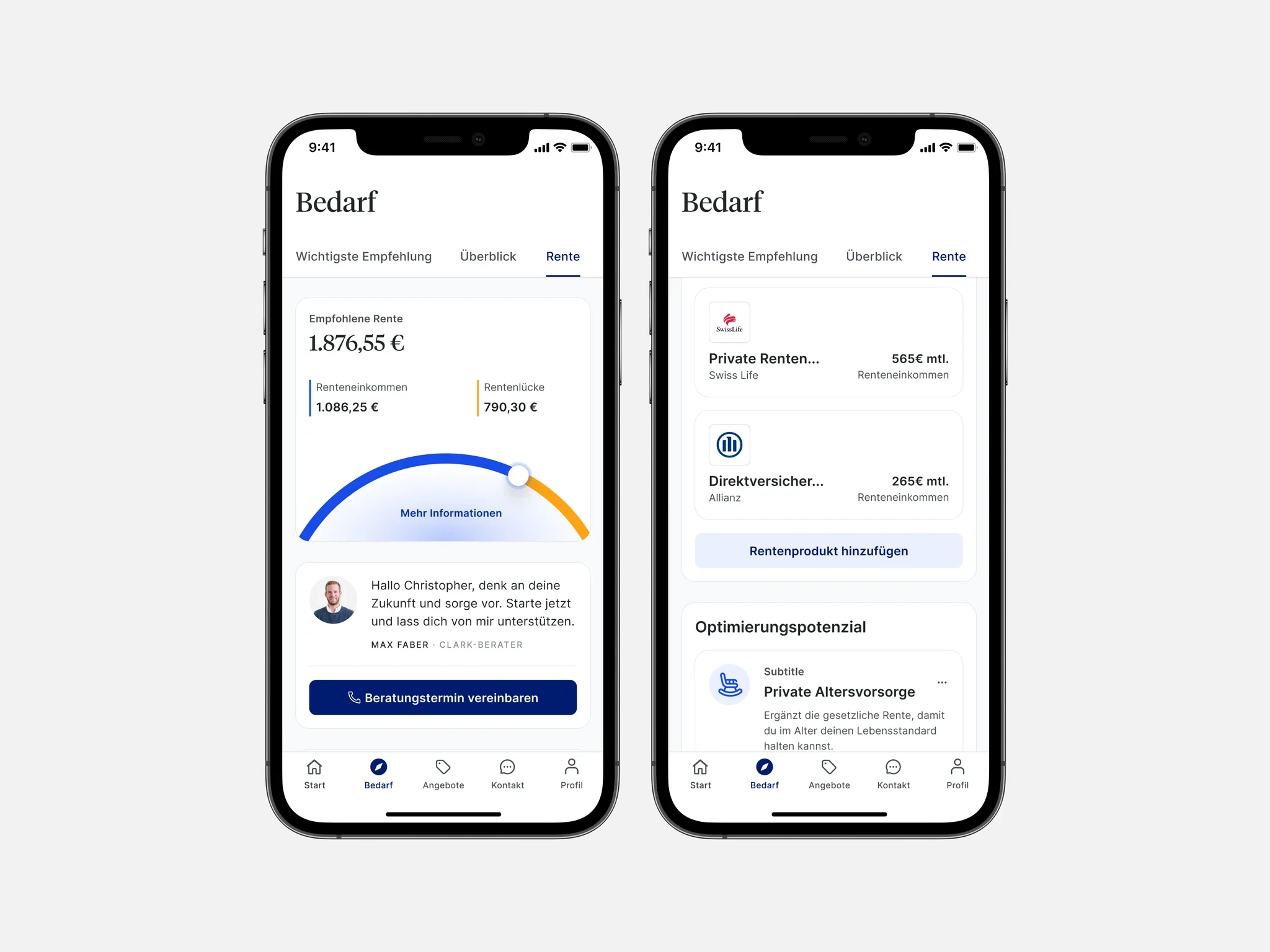
Cards
Modular, scannable layout showcasing 3 curated offers with trust badges and clear recommendation logic.
Scrollable List
135+ tariffs sortable by insurer, price, and coverage — making the promise of choice real and visible.
Product Detail
Expandable sections with category grouping, persistent pricing, and a checkout CTA always in view.
Feature Callout
Contextual help and chat support surfaced at hesitation moments to unblock uncertain users.
Meaningful impact across the funnel
This project reminded me how important it is to not confuse legacy with truth. Many limitations were cultural, not technical. Challenging assumptions that had gone unquestioned for 8+ years required patience, diplomacy, and data. But once we opened that door, even small shifts — like showing color logos or offering more than three options — had meaningful impact.