 BEWATEC · HealthLive5 min read
ConnectedCare App Redesign & Design System
The app worked. Patients could find schedules, call a nurse, and choose meals. I led an accessible redesign and design system to reduce usability risk under stress.
- Role
- Senior Product Designer
- Company
- BEWATEC
- Platform
- iOS & Android
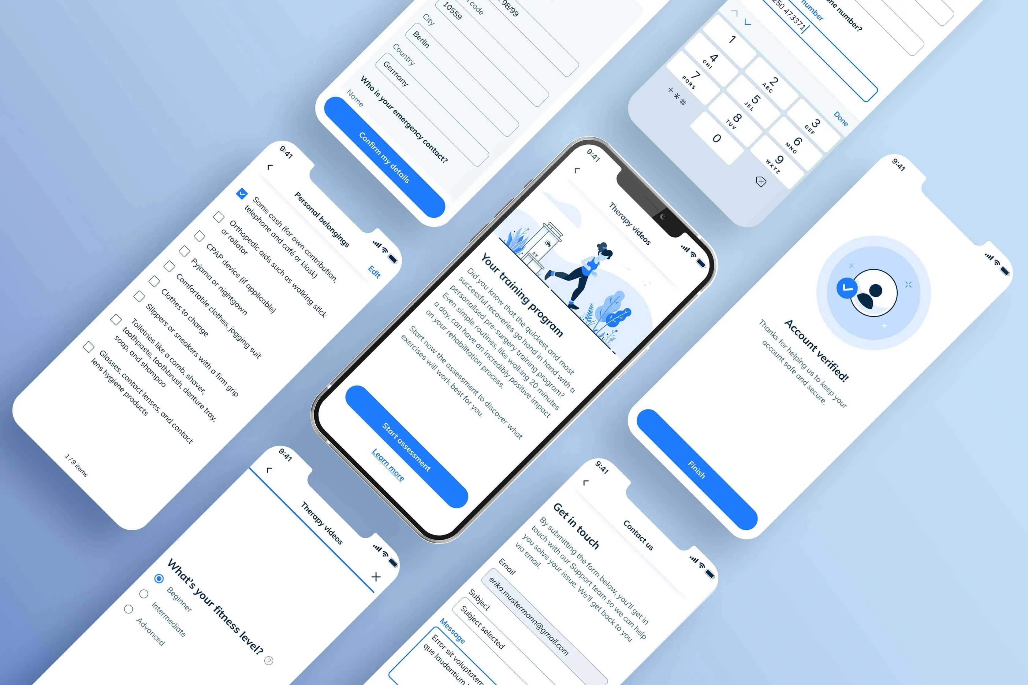
The visual issues were symptoms of a larger problem
ConnectedCare had been built quickly around its core functions. Patients could access hospital services from a bedside device, but accessibility, consistency, and trust risks had not been addressed.
There was no visual identity or shared interaction model. Contrast, typography, and touch targets had WCAG issues, while independently built screens looked like different products. Direct access to patients was restricted, so I treated these as documented accessibility and usability risks, not evidence of how patients felt.
The brief was open: rebuild the experience and create a system that could sustain later modules. I led product design, partnering broadly with product, engineering, hospital stakeholders, and staff. With no brand language or design documentation to inherit, accessibility became risk management under a proxy-research constraint.
Three problems were compounding
Three problems were compounding: the visual language, accessibility, and the lack of shared rules.
First: no visual identity. The app looked like internal tooling. No color language, no typographic system, no relationship between what the brand claimed and what the product communicated. Without direct patient evidence, I framed that inconsistency as a trust risk to test after launch, not a verified patient response.
Second: WCAG violations throughout. Contrast failures on text and interactive elements. Touch targets too small for patients who might be medicated, tired, or using a shared bedside device. Typography that did not scale correctly across screen sizes. These are not polish issues. In healthcare software, accessibility is a clinical consideration.
Third: no design system. Every screen was slightly different from the last: spacing, component behavior, and visual weight changed across similar elements. That inconsistency increased the risk that people would need to re-interpret familiar actions across modules.
Building the system with the first feature
Before detailed screen design, I aligned the system requirements with product and engineering. We then built the foundation in parallel with the meal selection module, using that feature to test components rather than extracting tokens after several disconnected screens existed.
The system had four requirements that were non-negotiable: WCAG AA compliance across every surface, scalability across at least three clinical modules, a token-based handoff that engineering could work from predictably, and visual performance on hospital network displays that often have compromised color accuracy.
46-tone palette. Each token audited for WCAG AA before production. The scale exists because a small palette cannot simultaneously satisfy accessibility requirements, dark-mode support, and clinical context differentiation.
Primary
Teal (Support)
Neutral
Semantic
Five content levels with explicit patient-facing scales. Legibility was the constraint. Text in a hospital app is read by people who may be tired, medicated, or using the device at an angle from a hospital bed.
4px base unit, aligned with engineering before any visual work began. When both sides work from the same spatial unit, spacing disagreements at review become a category of problem that no longer exists.
Stroke icon system. Semantic meaning agreed before visual style. Healthcare environments have established icon conventions. We followed them unless there was a clear reason not to.
Four decisions shaped the outcome
Most significant choices happened before or alongside the first detailed screens. The decisions that mattered were about sequence and method, not visual craft.
Run a brand workshop before opening Figma
I ran a two-day alignment workshop with BEWATEC stakeholders before starting visual design. The output was not a mood board. It was a shared vocabulary for what the product needed to communicate: four agreed brand values and a tone guide that every design decision afterward could be tested against.
Without a shared framework, design reviews become subjective negotiations. "Should this feel warmer?" is unanswerable. "Does this align with 'clear and structured'?" is not. I needed stakeholders to have a shared vocabulary before the first screen existed, so that feedback would be directional rather than preferential.
It delayed screen design by nearly two weeks. Some stakeholders questioned the time investment. A product team under feature pressure does not always welcome the idea of spending two days on brand attributes before any UI work begins.
The framework resolved most design disagreements before they became reviews. I referenced the four brand values in every presentation throughout the project. It became the single most durable artifact of the entire engagement.
Build the system alongside the first feature
I proposed building the design system in parallel with the meal selection module. The alternative was iterating across several screens and extracting tokens retroactively.
Healthcare software has slow release cycles and a high cost of visual inconsistency. Establishing shared rules early reduced the risk of carrying accessibility and interaction defects into later modules.
The first feature took longer because component rules and the implementation pattern were being established alongside it. Product and engineering needed a visible proof case while foundational work continued.
The system later scaled across three clinical modules without major revision. Engineering also reported fewer design questions during handoff than on previous projects.
Choose illustration over photography
I built a custom illustration library for all patient-facing onboarding and education content. The alternative was using photography or licensed stock imagery.
Photography in healthcare settings tends toward two failure modes: generic stock imagery that communicates nothing about the product, or real patient imagery that raises consent and emotional complexity. Illustration gives tone control. You can be warm without being saccharine. You can be informative without being clinical. That register is genuinely hard to achieve with photography in a hospital context.
Custom illustration is more expensive to produce and harder to update when content requirements change. We had to build a library large enough to cover anticipated use cases from the start, which required an accurate forecast of what those cases were before the product was fully specified.
The illustration system was adopted for all patient-facing education content across the app and became one of the most referenced parts of the design system in internal reviews. It was later extended to cover additional modules without requiring a visual rework.
Align the grid with engineering before visual work
I aligned on a 4px spatial grid with engineering before any design file was started, rather than proposing a grid after visual design was underway.
Handoff friction between design and engineering usually comes from inconsistent spacing. When designers use arbitrary values and developers round to their own system, quality erodes at the boundary. A shared grid is not a visual constraint. It is an organizational one. It eliminates a category of back-and-forth that otherwise repeats on every component.
Involving engineering early meant exposing incomplete thinking earlier than comfortable. Some developers expected to see more resolved work at that stage of the project. Managing that expectation required being explicit about what early alignment was for.
The grid held across three releases without renegotiation. Handoff was faster than previous projects and produced fewer revision cycles. The spatial system became part of BEWATEC's internal development standards.
Proving the system during delivery
Product and engineering leadership needed visible feature progress while the design system was being established. Under delivery pressure, infrastructure alone was a hard sell, especially when the previous product had shipped without a system.
I proposed building the system in parallel with a single high-visibility feature (the meal selection module) as a proof case. This gave stakeholders something tangible to review while the foundation was being laid. The first feature took longer because it also established patterns later modules could reuse.
The strongest case for the system was a working meal-selection feature. It let collaborators judge component reuse, accessibility, and handoff quality against a real delivery need.
The research gap I should have pushed harder on
The onboarding flow was redesigned based on brand values and usability principles derived from stakeholder input and staff interviews, not direct testing with actual hospital patients. Access to real patients during the design phase was restricted for compliance and practical reasons. I accepted that constraint too quickly.
The research informing the redesign came from hospital staff and proxy testing with healthy adults. That is a meaningful gap. Staff understand the product's function. They cannot reliably model the cognitive and emotional state of a patient using a hospital app on day two of a stay. Some of the onboarding language was revised after launch based on feedback from actual users. The illustration register in the first-time experience also needed a second pass because it read as too cheerful in a clinical context.
I would do this differently. The compliance constraints were real, but they were navigable with more deliberate stakeholder alignment earlier in the process. I did not make a strong enough case for research access before design work began. That is a process failure, not a design one, and it is mine to own.
Reported outcomes after launch
Starting from zero sounds like freedom. It is not. When you have nothing to push against, the decisions you make first shape everything that follows, and you will not know which of them were wrong until the product is in people's hands. On this project I learned that system governance is harder than system creation. Building the design system took months. Keeping it coherent across teams, releases, and evolving requirements took longer. The most important skill in that kind of work is not visual craft. It is the ability to make abstract decisions legible to stakeholders who have competing priorities and limited time.
The unresolved lesson is research access. Staff interviews and proxy testing helped reduce obvious accessibility and usability risks, but they could not tell me how hospitalized patients interpreted the experience. I should have negotiated direct access earlier. Until that evidence existed, reassurance remained a design intention, not a patient insight.