New Onboarding Journey
Re-architecting a 15-step commitment wall into a modular, trust-first system — lifting mandate acceptance 30% and generating €582k in new annual revenue.
- Role
- Lead Product Designer
- Timeline
- July – December 2025
- Platform
- iOS · Android · Web
- Stack
- Next.js · Tailwind · shadcn/ui
Six months. Four stakeholder groups. One system.
CLARK's onboarding wasn't broken in the way most people assume. The UI was clean. The brand was strong. The problem was structural: a linear, 15-step flow that asked users to commit fully before ever experiencing any value.
Mandate authorization — a legal necessity in insurance — was placed front and center, before trust had been established. Only 24% of users understood what they were granting. 61% never made it through.
This wasn't a UI problem. It was an architectural one. The solution wasn't a redesign — it was a system rebuild: six modular steps, a trust-first communication layer, and a component architecture built to scale across every future CLARK onboarding surface.
A monolithic flow asking for everything, explaining nothing
The original onboarding was built to handle every edge case in a single linear path. Every user — regardless of their insurance situation, motivation, or literacy — went through the same 15 steps in the same order.
At step 8, users were asked to grant CLARK a management mandate: a legally significant authorization that let us act on their behalf with insurers. It was explained in legal language, appeared without context, and felt like signing something important for a service they hadn't yet benefited from.
The mandate wasn't the real problem. The architecture around it was.
What the data couldn't tell us — and what our users could
We started with a competitive benchmark. Lemonade, Alan, Wise, and N26 all share a structural pattern: they defer commitment until the user has experienced something real. Value precedes authorization. We weren't doing that.
In user interviews, the picture clarified quickly. The hesitation wasn't about insurance complexity — it was about trust timing. Users weren't refusing to grant the mandate. They were refusing to grant it to a brand they hadn't yet decided to believe in.
- Users wanted to understand their existing coverage before being asked to act on it.
- Semi-automated mandate management was strongly preferred over fully automated — control matters more than convenience in regulated contexts.
- Legal language in the mandate screen was a consistent source of anxiety, not understanding.
- Users who saw a concrete benefit from CLARK before the mandate screen had a 3× higher acceptance rate.
- The number of steps wasn't the friction — it was the perceived risk of each step without context.
Two shifts that changed everything
Before touching wireframes, we needed to agree on a strategic direction. I worked with Product, Data, and the EXCO to frame the redesign around two clear shifts.
Commitment-first → Value-first
Stop asking users to trust us before we've given them a reason. Show the analysis, surface the insight, demonstrate value — then ask for authorization. The mandate stays; when we ask for it changes everything.
Monolithic → Modular
One linear path for every user is unmaintainable and unscalable. A modular system adapts to context: who the user is, what they already have, what they actually need. This also unlocks post-mandate reactivation flows — something the old system couldn't support.
Both shifts required alignment across four stakeholder groups: Product, Engineering, Data, and EXCO. Each had different concerns. I ran separate alignment sessions and built the rationale in the language each team understood — funnels for Data, component architecture for Engineering, business impact for EXCO.
Thinking in systems, not screens
The biggest design decision in this project wasn't visual — it was architectural. We had to decide how onboarding components were structured, shared, and sequenced across platforms. That decision shaped every screen we built afterward.
We built the new onboarding in Next.js with a modular page architecture: each step is an independent component with its own data requirements, validation logic, and routing conditions. Steps can be reordered, skipped, or injected based on user state — without touching the surrounding flow.
Next.js Modular Routing
Each onboarding step is a self-contained route. This enabled A/B testing at the step level, parallel engineering work across the flow, and clean separations of concerns between registration, verification, and mandate phases.
Component System (shadcn/ui + Tailwind)
We adopted shadcn/ui as the component foundation — accessible, unstyled, composable. Tailwind utilities gave us design-system alignment without maintaining a separate token layer. I worked directly with engineers to define component APIs for inputs, progress indicators, and consent surfaces.
Shared State Architecture
Onboarding state is persisted across sessions so users never lose progress. I mapped the state shape with engineering early — it influenced how we grouped step data and how partial completions were handled in the backend.
Reusable Across Surfaces
The same component set powers web, iOS (via web view), and Android. Designing with this constraint from day one forced layout decisions that aged better than native-only assumptions would have.
Three layers of a redesigned system
01 — Registration redesign
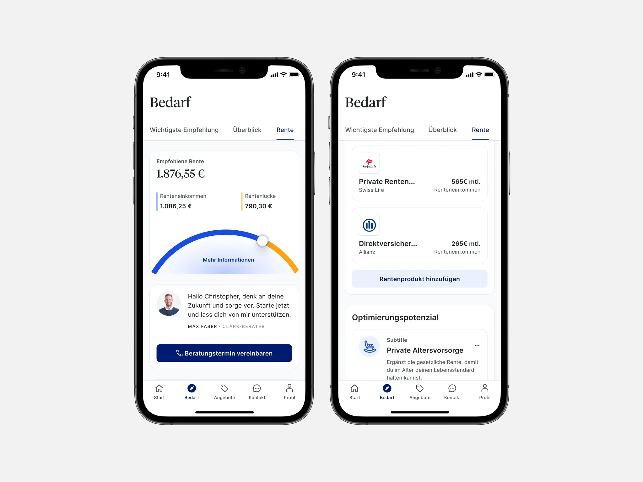
We reduced registration from 15 steps to 6 by eliminating redundant fields, deferring insurance-specific data collection to post-mandate, and consolidating screens that were split for legacy technical reasons, not user reasons. Each step now has a single job. Progress is visible. Exit points are clearly signposted.
The order of steps was redesigned based on drop-off analysis. Steps with the highest cognitive load were moved later — after users had invested enough to stay. Steps with the highest value signal were moved earlier.
02 — Trust & transparency
The mandate screen was rebuilt from scratch. Legal language was replaced with plain-language explanations co-written with legal and validated through user testing. We added a visual breakdown of what CLARK can and cannot do on the user's behalf — explicit control improved acceptance, not undermined it.
We also introduced social proof elements, clear revocation instructions, and a "what happens next" summary immediately after acceptance — turning a moment of anxiety into a moment of confirmation.
03 — Modular post-mandate journeys
The old system ended at mandate acceptance. The new system begins there. Once a user has completed registration, they land in a modular activation flow where CLARK surfaces their existing insurance portfolio, identifies gaps, and makes concrete recommendations — all personalized based on what we now have permission to see.
This post-mandate layer is built from the same component system as registration, making it extensible. New product verticals can inject their own activation step without modifying the core flow.
Design as a cross-functional function
This project operated at a different level of collaboration than most. By month two, I was sitting in engineering planning sessions — not as an observer, but as someone with opinions on component architecture, state sequencing, and implementation trade-offs.
- With Engineering: Defined the shadcn/ui component API for consent surfaces. Reviewed pull requests for design fidelity. Flagged implementation deviations before they shipped — not after.
- With Data: Co-defined the funnel instrumentation plan before a single screen was built. Agreed on what a successful onboarding looked like in measurable terms before we had to debate it post-launch.
- With Product: Ran biweekly scope reviews to prevent the flow from expanding back to 15 steps as stakeholders added requirements. Held the line on what belongs in registration vs what belongs in activation.
- With EXCO: Prepared and presented the business case for the modular architecture, connecting system decisions to revenue projections. Got sign-off not just on the design, but on the approach.
The quality of the shipped product reflects that. Designs didn't degrade between handoff and production because I was present for the translation. That's not a nice-to-have — it's part of the job.
Business outcomes, not design metrics
We measured success on business terms from the start. Mandate acceptance rate, conversion to first recommendation, and projected annual revenue impact were defined before design began. The results validated both the strategic shifts and the architectural decisions.
The most important decision in this project wasn't a design decision — it was an architectural one made before any screen was built. I've become more convinced that senior product designers need to operate at the system level: understanding how components are structured, how state flows, how engineering decisions propagate into user experience downstream. The difference between a screen designer and a product systems thinker shows up most clearly when things get complex. This project was that complexity. The constraint of regulated products taught me that trust isn't a feeling — it's a design material with its own rules, timing constraints, and failure modes. Speed and control aren't opposites, but they're in permanent tension. Getting that balance wrong costs mandates. Getting it right generates revenue.