Mi Vodafone App — Cross-selling & Checkout Redesign
Designing a new purchase experience for 3M+ existing customers.
- Role
- Senior Product Designer
- Company
- Vodafone Spain
- Platform
- iOS, Android & Web
A new squad, a global pandemic, a blank canvas
I joined the TX Handsets squad within the Care Tribe of Mi Vodafone App in March 2020 — the same week Spain entered lockdown. As the senior designer on the squad, I led the design process end-to-end and coordinated with junior designers throughout the project.
The challenge was to create a dynamic cross-selling flow for existing Vodafone customers to discover, configure, and add products — all within the app — while increasing the average cart ticket per transaction.
Alignment first, pixels second
Before any design work began, I organized alignment sessions with the Product Manager, Product Owner, Business Analyst, and Technical Leads to surface constraints and map the opportunity space together.
- Facilitated a Miro session to map current and future flows using a modular "Lego pieces" approach — giving all stakeholders a shared global vision.
- Built the first prototype in InVision, Vodafone's internal prototyping tool at the time.
- Ran remote user testing with 10 Spanish Vodafone customers via Lookback.io — mixed ages and genders, all active app purchasers.
- Testing was fully remote due to COVID-19, which shaped how we structured tasks and recruited participants.
A clear framework before a single pixel
- Create a seamless cross-selling entry point for existing customers
- Design a PLP → PDP flow that guides users from intent to configuration
- Build a flexible Nexus screen for cross-selling between offer and checkout
- Unify the checkout experience across all sales flows in the app
- Keep checkout to a maximum of 4 steps, minimum of 1
- Deliver fully within Vodafone's existing design system
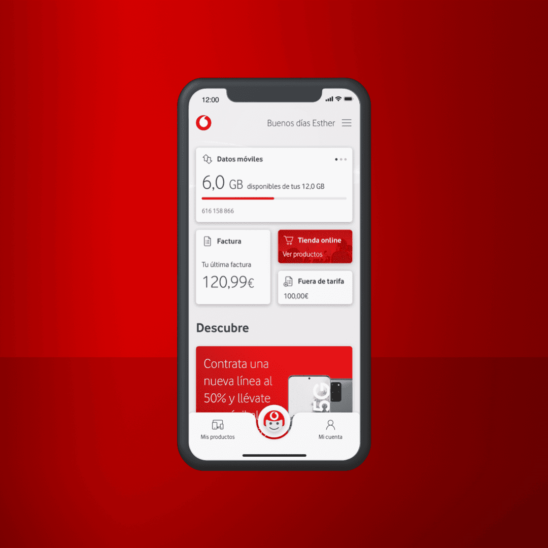
Two entry points. One unified checkout.
Dual Entry Points
Online Store for intent-driven browsing, and a Discover section serving personalized offers via banners — meeting customers wherever they are.
PLP → PDP Flow
Users select a plan then configure it — associating to an existing number or initiating portability — in a guided, linear flow.
Nexus Screen
A cross-selling hub between the offer and checkout. Modular and customizable based on the customer's accumulated products and eligibility.
Unified Checkout
Maximum 4 steps, minimum 1. A single checkout architecture adaptable to any sales flow across the entire app — replacing fragmented one-off implementations.
Impact across the purchase funnel
Designing during COVID taught me that alignment is a design skill, not a prerequisite for one. The Lego pieces approach — treating flows as modular, composable blocks — gave stakeholders ownership and gave the team clarity. Unifying checkout across a platform at this scale required as much organizational design as it did interface design.