 BEWATEC · HealthLive4 min read
Digital Patient Admission
Hospital admission demanded complete records from patients arriving tired and anxious. I designed a configurable flow that preserved required information while reducing avoidable nurse correction.
- Role
- Senior Product Designer
- Company
- BEWATEC
- Platform
- iOS & Android
The system was built, but admission was still on paper.
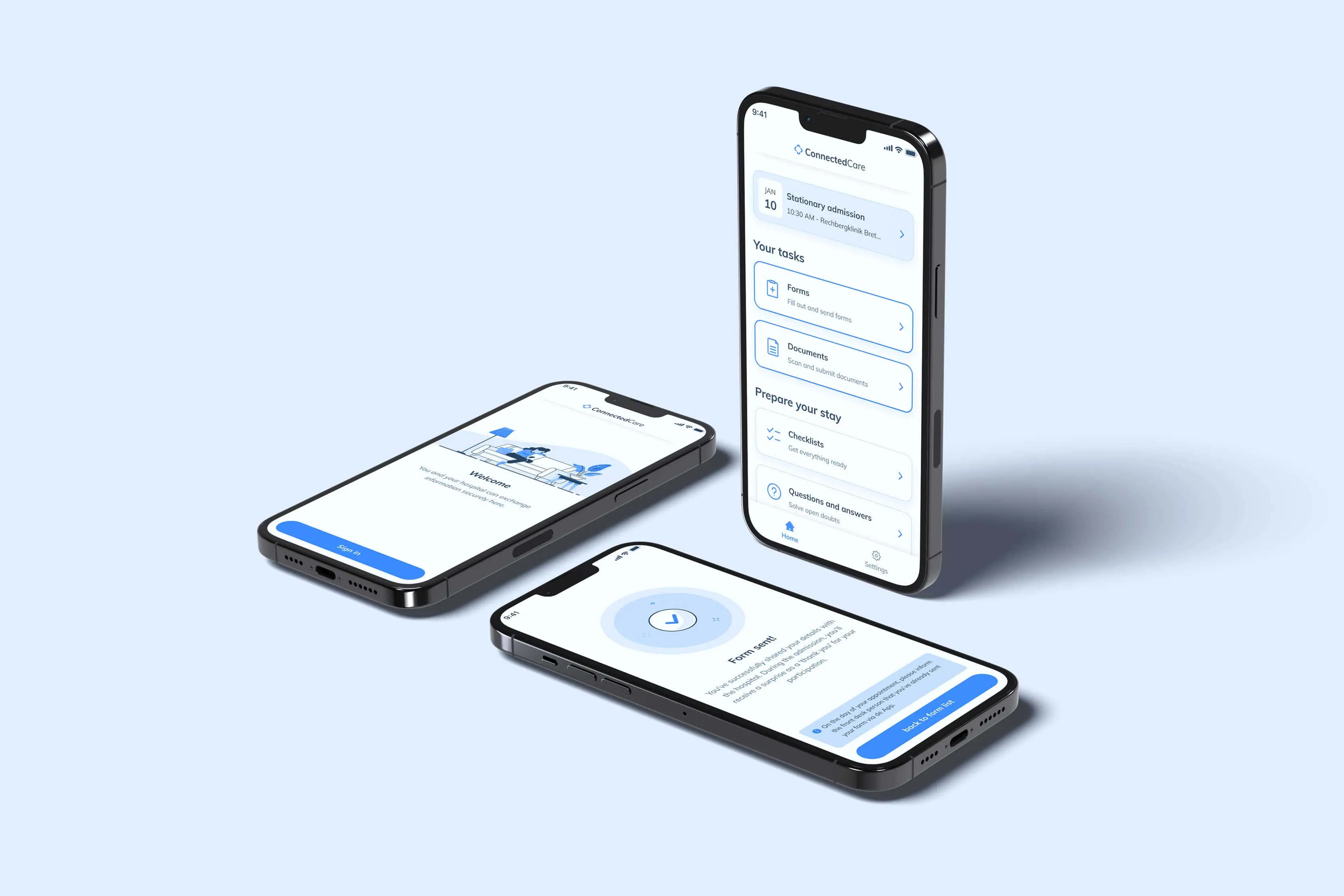
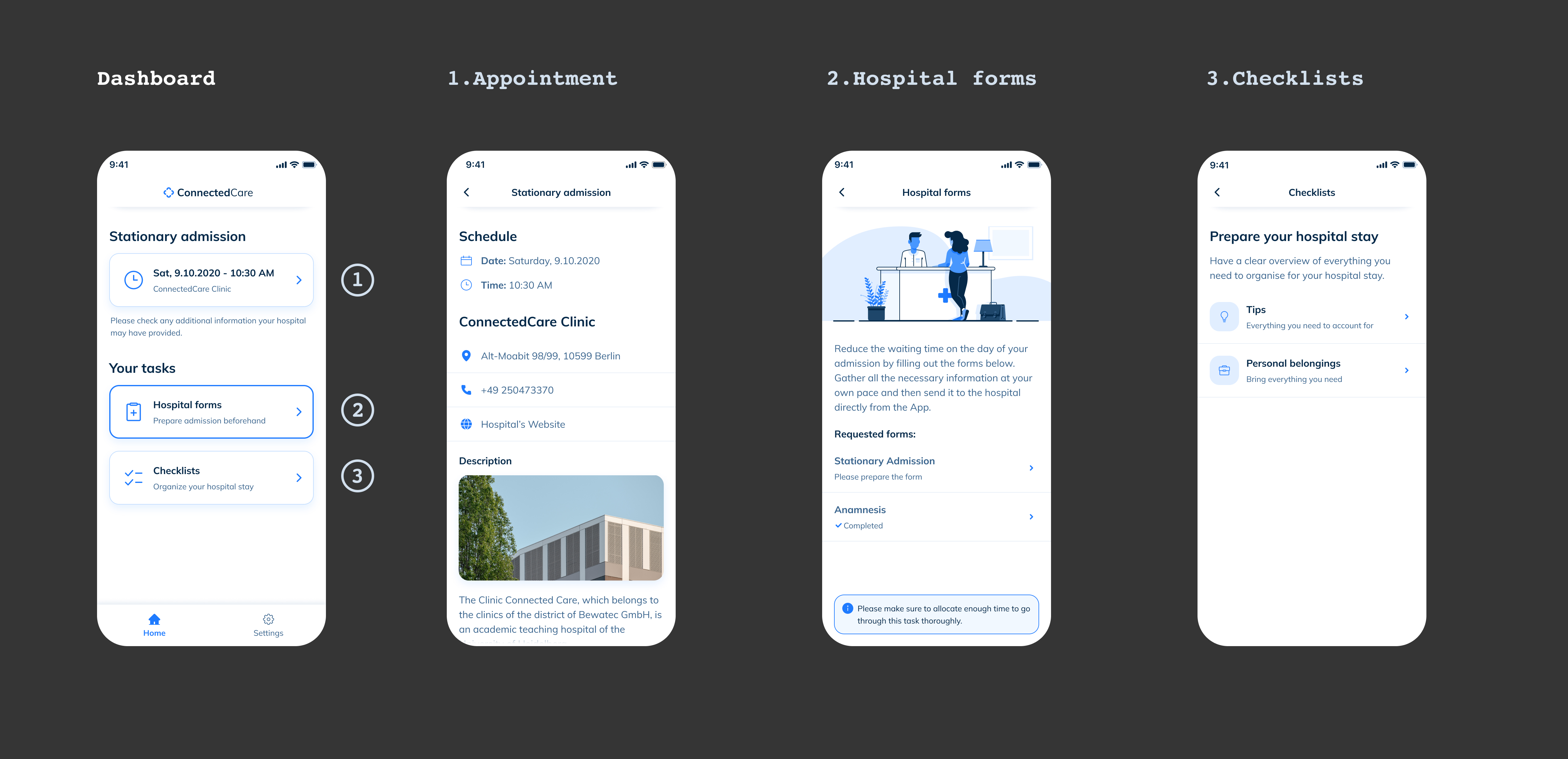
ConnectedCare already provided a digital task shell and document upload, supported by its design system. It did not yet handle the full admission: structured forms, consent, signatures, and handoff of a complete record.
Admission was still paper. Insurance card copies, consent documents, medication declarations, GDPR acknowledgments. On a busy ward, each admission took around 25 minutes of nurse time. Patients spent the first part of their stay in an unfamiliar room, filling out forms they did not fully understand, without orientation to their environment or the people who would be caring for them.
The brief was narrow in scope but technically complex: extend ConnectedCare from task prompts and uploads into a full digital intake process. Forms, consent, and hospital-approved signature requirements. Built on the existing design system. Configurable across 40+ hospital partners without requiring custom design work per deployment. Three months to first pilot.
Watching the process first
I observed 12 patient admissions across two hospital partners and interviewed eight nurses about their workflows. The list of required forms already existed. I wanted to see when completing them became difficult, and why.
Two findings changed the direction of the work.
First: the tension was completeness versus readiness. Patients were asked for insurance numbers, medication names, and emergency contacts before receiving basic orientation. Observations showed tired or anxious patients struggling with this sequence, followed by nurse correction. The sequence was organised around the hospital's record, even when the person completing it was tired, anxious, or still trying to understand the ward.
Second: a separate early signature test with five participants exposed uncertainty about digital signatures. Three of five asked a nurse what the signature meant before continuing. They did not know whether they would receive a copy and expected paper at the end.
Usability test results
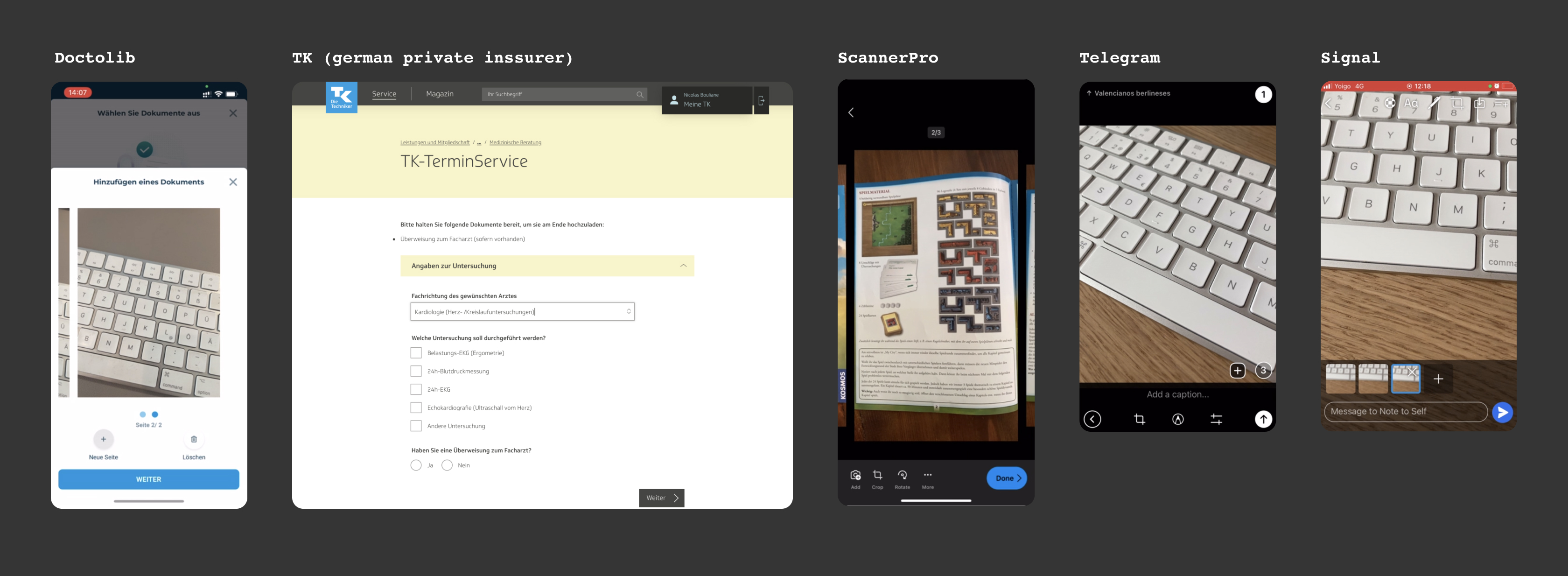
After the 12 observed admissions and eight nurse interviews, we ran a separate usability test with nine participants across two hospital partners. This test focused on document capture and task flow; it was distinct from the five-participant signature check above.
| Severity | Topic | Description | Assessment | Status |
|---|---|---|---|---|
| High | Automatic identification / option to adjust pictures | 6/9 participants asked for an option to adjust the picture (frame, automatic identification, cut). Several participants (4/9) asked for an option to correct the order of the pages. | Increased likelihood of patients sending bad quality pictures to the hospital (pictures that are too large or miss parts of the page). | Solved |
| High | Focus in the preview stays on page 1 | When users take more than one photo of a document, they are always focused on page 1 in the preview. This can be confusing and also lead to extra work, as they need to scroll through the images to get to the image that they have just taken. | This behaviour makes it difficult for users to check the quality of their scans before sending them to the hospital, potentially leading to bad quality pictures being sent. | Solved |
| Medium | "I'll do it later" flow | After selecting "I'll do it later" on the send document screen, the user is redirected to the home screen. In the user tests, some participants were confused. | Selecting "I'll do it later" should link to the list of documents, so that users see whether further documents need to be scanned. | Solved |
| Medium | "Retake picture" misleading | The button label "Retake picture" is misleading. After pressing this button the camera view opens making the user believe that the previously taken pictures are deleted, while in fact a new picture is added to the previously taken pictures. | Users have to actively delete previously taken pictures. If they don't, the hospital has to deal with multiple pictures of the same pages. | In progress |
Four constraints we could not avoid
- Digital signatures that met hospital-approved legal and audit requirements. Not a checkbox: explicit confirmation and document delivery were required.
- Content accessible in at least four languages reflecting Berlin hospital patient demographics: German, English, Turkish, Russian. Language switching available at any point in the flow.
- Compatible with existing BEWATEC tablet hardware. No changes to device specs or OS requirements.
- Form structure configurable by hospital administrators without design or development involvement. Each hospital partner had different admission requirements.
Three decisions that needed explaining
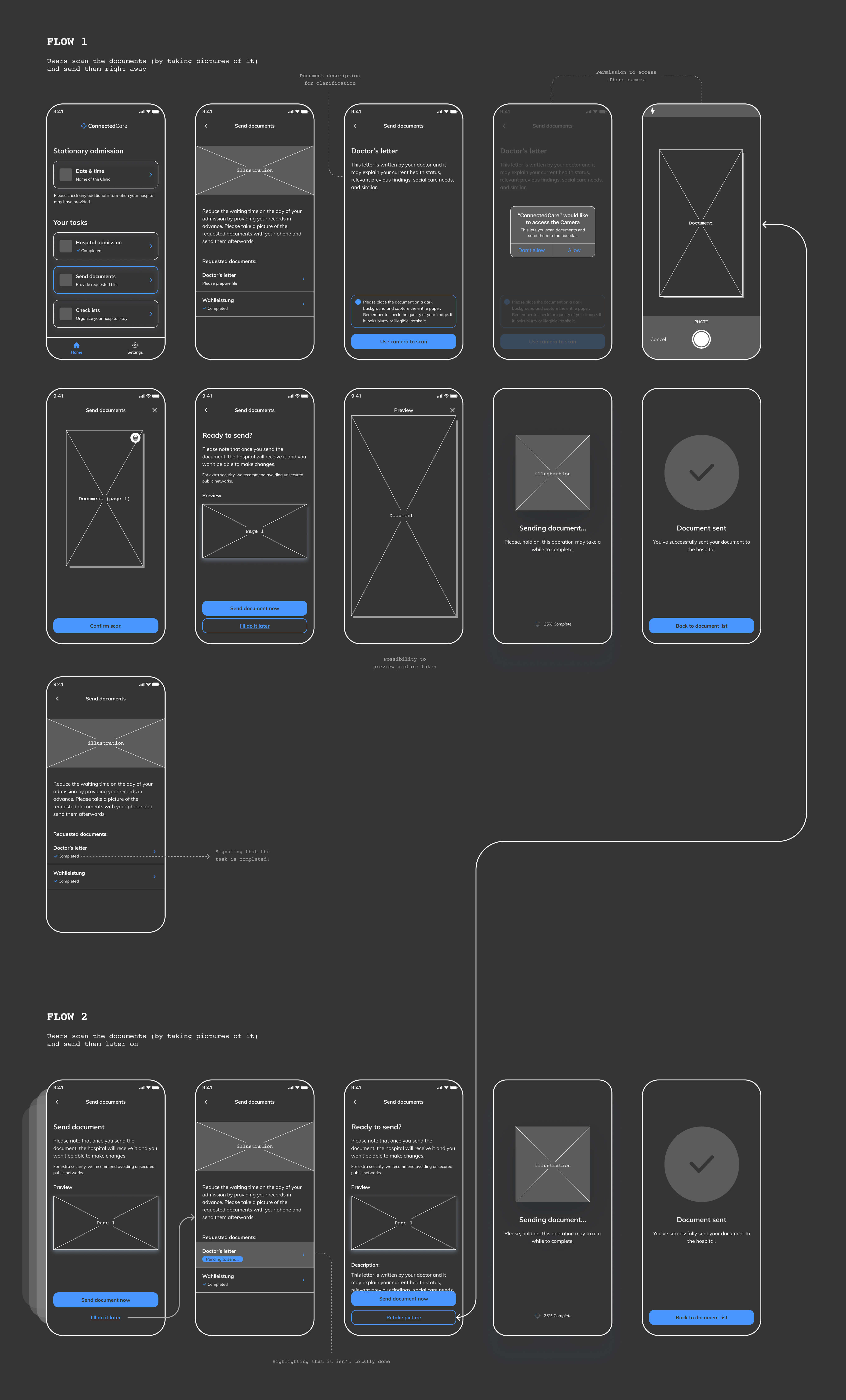
Put patient readiness before institutional order
I proposed reorganizing the admission sequence so that orientation and simple questions came first, and complex documentation came after the patient had time to settle. Insurance numbers and medical history later. Room orientation and primary contact early.
Observed admissions linked confusion and fatigue with incomplete or incorrect answers that nurses then corrected. Re-sequencing tested whether the same required content could be collected with less avoidable correction.
The hospital's nursing workflow system expected admission data as a single complete submission. Phasing data collection meant engineering had to support partial admission states and batch completion notifications. That was a meaningful backend change that required alignment with hospital IT teams at each partner site.
In the pilot cohort, forms requiring nurse correction were roughly 60% lower than with the traditional sequence. Nurses also reported fewer interruptions during admission; the pilot cannot isolate sequence as the only cause.
Explain the signature before asking for it
I designed the digital signature flow to explain what signing means before asking for consent: what is being signed, what it means legally, how to request a copy. The confirmation step shows a full summary of what was agreed to, with a PDF delivery option. This added three screens to the signature step.
The signature check involved five participants, so it was small, but it exposed a clear comprehension gap. The flow had to satisfy hospital-approved requirements while helping patients understand what they were signing and what record they would receive.
Two hospital administrators preferred a shorter process. I used the early finding (three of five participants asked a nurse for an explanation) to justify testing added guidance rather than treating fewer screens as success.
In the subsequent signature-flow test, 94% of attempts were completed without nurse intervention. This measured task completion in that test context, not legal comprehension across all patients.
Build a constrained form system
Rather than designing a flexible drag-and-drop form builder, I defined four field types, three layout patterns, and composition rules. Hospital administrators configure forms within those constraints. Engineering built the configuration layer on top of them.
An unconstrained form builder would make the result difficult to maintain. Administrators needed freedom within rules that protected accessibility, consistency, and the existing design system. Those rules became part of the product.
Some hospital partners wanted form layouts that the constraint system could not produce. We had to negotiate what configurable meant, and where the system's boundaries were. Two partners required custom components that were not in the initial system. Both were later added to the design system and made available to all partners.
The initial component set covered 38 of 40 documented partner requirements. Two requirements needed new reusable components, which were added to the library for all partners rather than delivered as one-offs.
Complete records with fewer correction cycles
Hospital administrators wanted the digital admission to replicate the paper process exactly: same sequence, same fields, same grouping. Nursing teams wanted a faster process. Patients needed a calmer one. Three stakeholders with three different definitions of "better" and no shared framework for resolving the conflict.
We piloted the re-sequenced flow alongside the traditional order at two hospitals. Forms requiring nurse correction were roughly 60% lower in this pilot comparison. Administrators accepted the new sequence because it preserved required content while reducing correction cycles.
When stakeholders disagree about what "better" means, the most useful thing design can do is create a shared test, not a shared opinion. A pilot with clear metrics gave each group their own evidence. Nobody had to be persuaded. They just had to look at different numbers that told the same story.
Two additions to the existing system
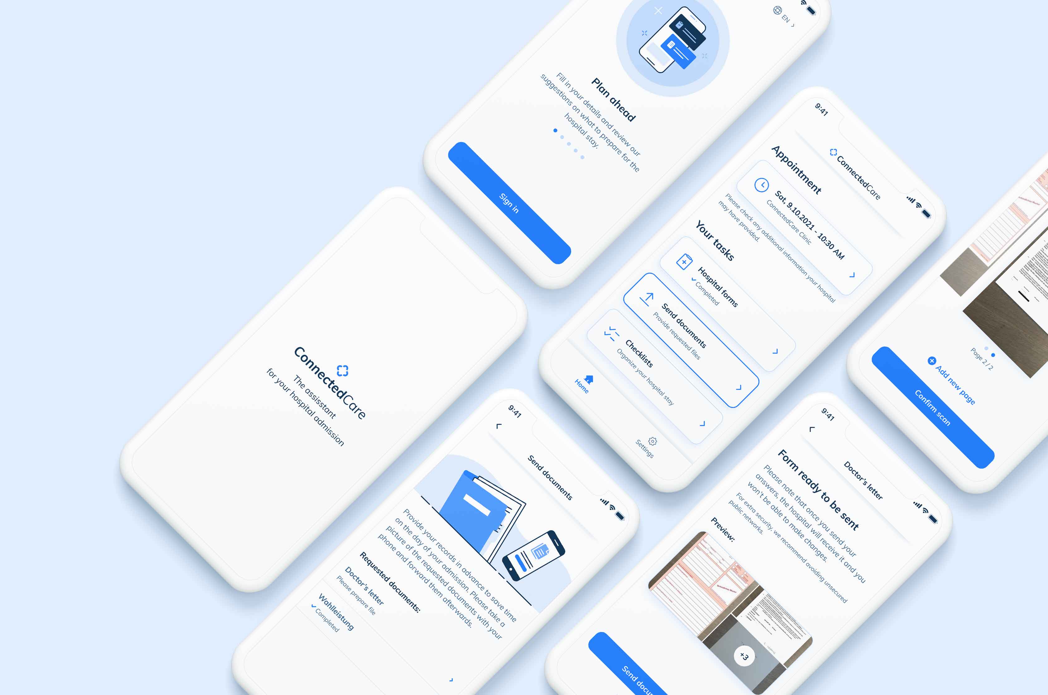
Every screen started from existing design-system tokens, patterns, and components. Most of the flow shipped from that library; two gaps surfaced during delivery.
A few places exposed gaps. The signature flow needed a specific confirmation state that did not exist in the component library. The language selector needed a new pattern for inline language switching that was not previously defined. Both were added to the system rather than handled as one-off solutions, which is how a design system matures: through the pressure of real features rather than theoretical completeness.
Language switching lost entered data
The language switching behavior had a significant problem I did not anticipate during design. When a patient switched languages mid-form, all data they had entered was lost. A patient who started in German and switched to Turkish after the third screen lost everything and had to start again.
This was a technical constraint that surfaced during development and was not resolved before the first release. I should have defined language switching as an interaction at the start of the project instead of leaving its behaviour to implementation. "Support multiple languages" and "support switching languages mid-flow without losing state" are different requirements. I wrote the first. I should have written the second.
The issue was addressed in a follow-up release three months after the pilot launched. It affected a small proportion of users in the pilot cohort, but it was avoidable if I had been more precise in specifying edge cases during the design phase.
What the pilot showed
Watching 12 admissions before drawing exposed what the brief missed: digitizing paper would preserve a sequence that exhausted patients struggled to complete and nurses had to repair. Re-sequencing was promising, but the pilot evidence was contextual rather than proof of broad causality. I would now define comparison measures and sample sizes before launch, not reconstruct their limits afterward.
I also described the feature too neatly as built from the existing system. In practice, two requirements exposed missing components. The stronger account is that the library provided the foundation, while delivery improved it. Reusable additions are evidence of a system learning from real constraints, not evidence that it was complete beforehand.