 Pets Deli · E-commerce5 min read
Owning Conversion at Pets Deli
Pets Deli was growing in brand but losing customers in the funnel. I used analytics and research to frame decisions, then worked with Product, Engineering, and Design/CRO to test them.
- Role
- Senior Product Designer
- Year
- 2021–2022
- Platform
- Web · E-commerce
A strong brand with a leaking funnel
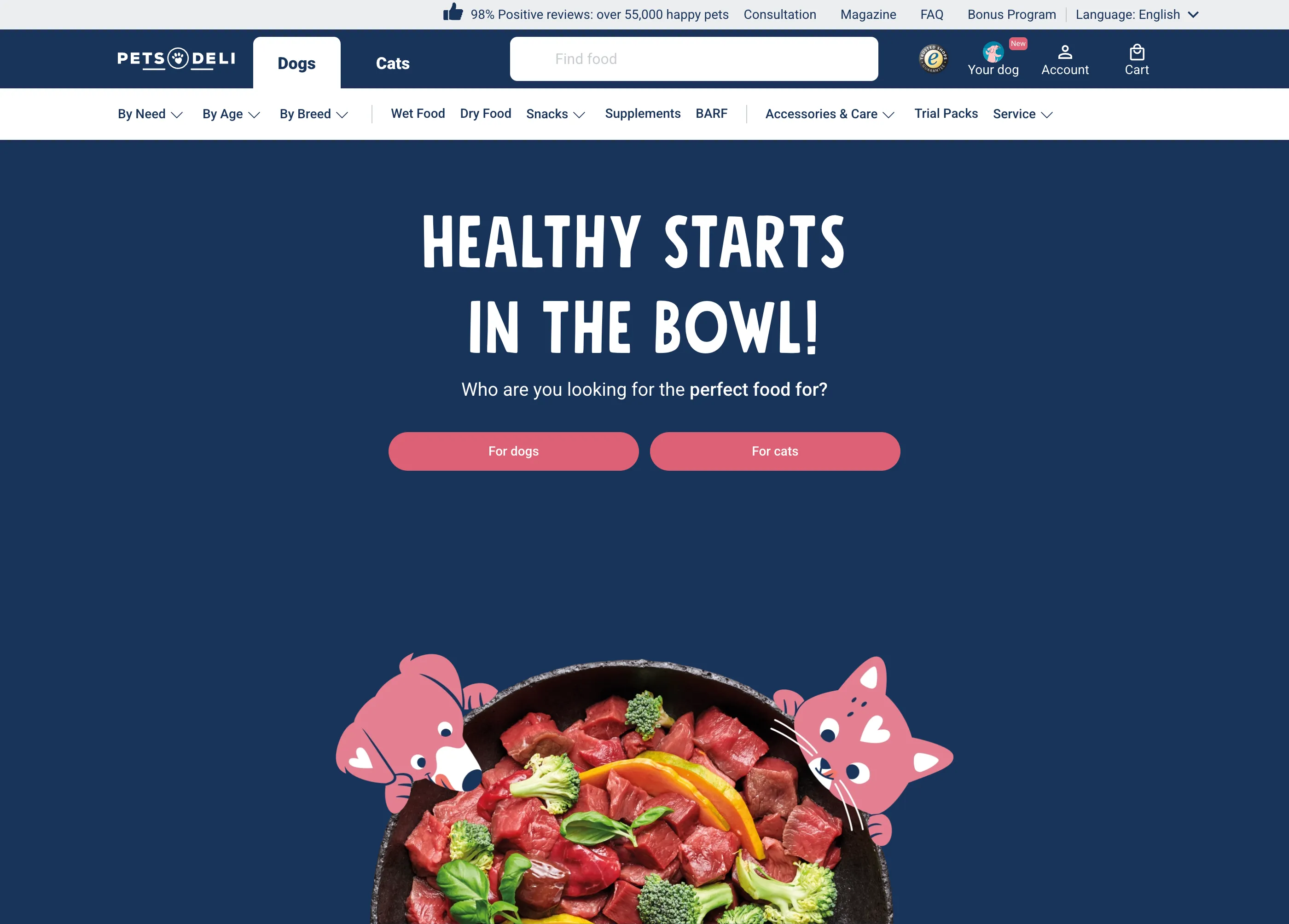
Pets Deli had built a loyal customer base around premium, natural pet food. You could see that in the ingredients, the recipes developed with vets, and the packaging. The product was good; the online store did not always make that clear.
But the online store wasn't keeping up. Customers were arriving with intent and leaving without buying. The funnel had friction at every stage: discovery felt overwhelming, the cart didn't make the case for the order, and checkout introduced just enough doubt to tip people out. The brand's warmth stopped at the homepage.
The journey had three breaks
When I mapped the purchase journey end to end, customers usually had a reason to buy. The friction appeared at three specific moments: choosing a product, reviewing the cart, and paying.
The product detail page didn't give customers enough to commit. Information was sparse where it needed to be rich (ingredients, sourcing, dietary fit) and cluttered where it needed to be simple (the add-to-cart decision). Customers were leaving to Google what they should have found on the page.
The cart read like a receipt, not a reinforcement. It listed what the customer had chosen but made no case for why that was the right choice. Subscription savings weren't surfaced. Delivery promises were buried. The emotional momentum from the product page had nowhere to land.
Checkout introduced doubt. Form complexity, unclear delivery windows, and an absent trust layer at the payment step were driving drop-off at the highest-intent moment in the entire funnel.
Reading the data with customers in mind
I started with session recordings and funnel analytics: not to declare answers, but to locate friction and frame questions. Where were people pausing? Where were they rage-clicking? Which pages saw the most back-navigation? I then used customer research to interpret those patterns with Product and Design/CRO partners.
- Customers shopping for special diets spent longer on PDPs but converted less often, pointing to missing dietary information.
- Session recordings around the order total suggested that some customers were reconsidering whether they had chosen correctly.
- First-time buyers dropped off at payment more often than returning customers, making trust and delivery clarity test priorities.
- Customers who used filters converted more often, while low usage suggested that discovery needed clearer entry points.
- Mobile abandonment was higher than desktop across the funnel, so variants were designed mobile first.
These signals did not prove a cause. They gave us hypotheses that Engineering could implement and Design/CRO could compare in controlled variants.
What we needed to solve
- Give customers the information they need to commit on the product page, without overwhelming the decision
- Make the cart feel like a confirmation of a good choice, not just a list of items
- Remove doubt at checkout: trust signals, clarity, and no surprise friction
- Make product discovery work on mobile first, desktop second
- Build every solution to be testable: hypothesis, variant, measurement, decision
Three areas to test
For each area, analytics located the break, research helped explain it, and the team turned that explanation into a measurable experiment.
Product Detail Page
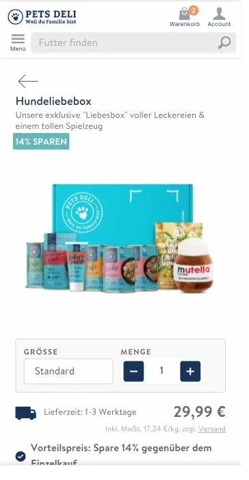
The PDP needed to answer two questions fast: is this right for my pet, and why should I trust this brand? I restructured the information hierarchy: moving ingredient quality and dietary suitability above the fold, and grouping detailed specs into collapsible sections for customers who wanted to go deeper.
The add-to-cart area became a cleaner decision zone: quantity, subscription option, price comparison, and a single primary action. No competing calls-to-action. The brand's premium positioning, which customers trusted offline, now had a visual equivalent on the product page.


Cart Experience
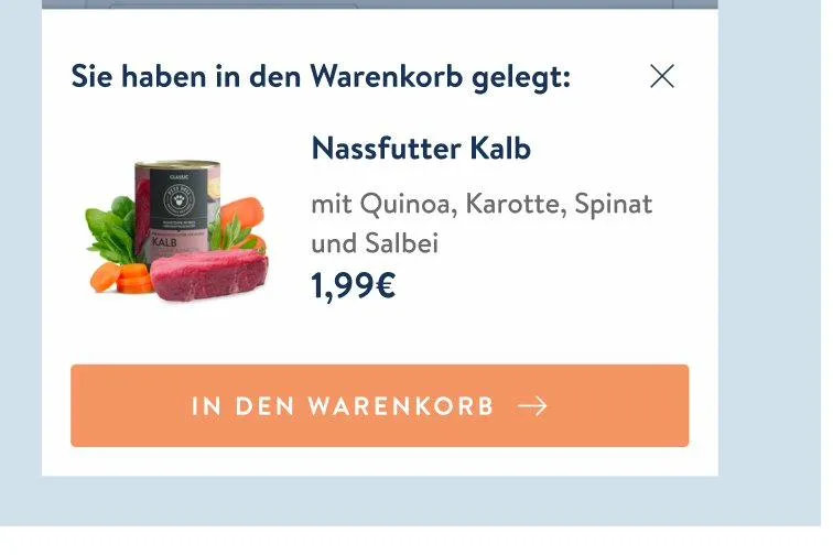
The cart redesign started with one observation: customers who left were not necessarily rejecting the product; they were losing confidence in the order. We used the cart to reinforce the decision instead of just listing its contents.
Subscription savings were surfaced inline next to the price: not as an upsell banner, but as a contextual comparison. Delivery promise moved to the top of the cart. A quality reassurance message, referencing Pets Deli's sourcing and vet development, appeared between the cart items and the checkout CTA.
Product Discovery
The category navigation was a flat text list: no visual cues, no sense of what sat behind each section. I replaced it with Category Stories: circular, tappable entry points at the top of the shop showing actual product imagery for each food type. Familiar from social media, zero learning curve.
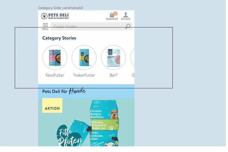 Wireframe
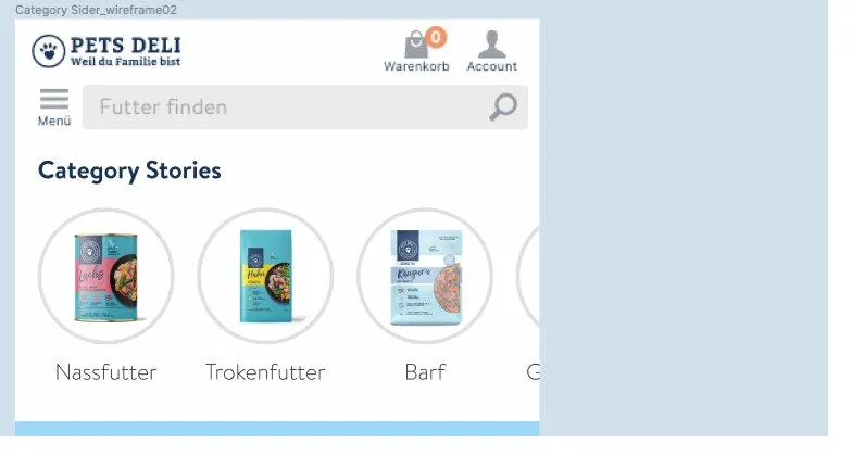 Iteration
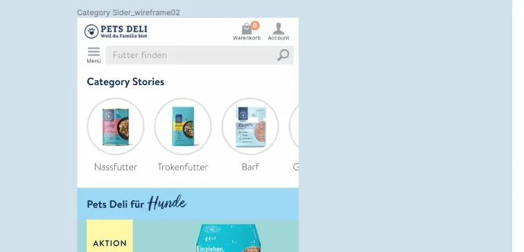 Final
Final
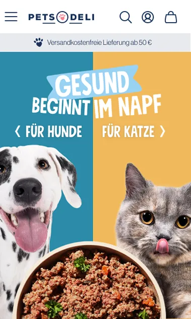
Brand continuity
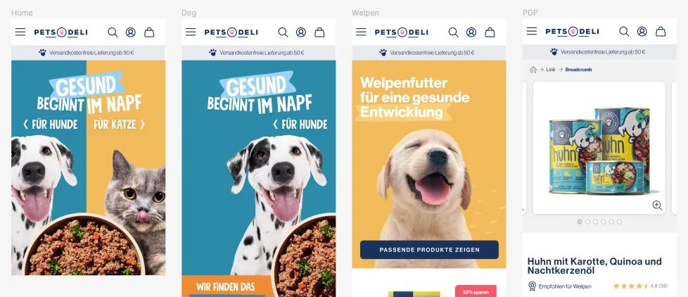
Beyond the funnel work, I collaborated with the brand team to extend Pets Deli's visual identity into the digital product. The warmth and character of the brand, which showed up clearly in packaging and campaigns, wasn't present in the UI. Small, deliberate choices: photography direction, tone of microcopy, illustration style.
Protecting the test while shipping
The organization wanted to ship design changes fast: the funnel was leaking revenue daily. But shipping without testing meant guessing which changes drove lift and which were noise. Protecting a test-and-learn process inside a company under growth pressure required making the case, repeatedly, that slower validation would produce more durable results.
We agreed on experiment cycles with explicit hypotheses, comparison variants, and decision criteria. Some strong ideas waited longer than leadership wanted. The trade was clearer evidence: winning and losing variants could inform the next decision instead of becoming isolated releases.
CRO is not about finding one right design; it is about separating diagnostic evidence, hypotheses, variants, and decisions. My most durable contribution was making that sequence explicit so the team could learn from each release instead of relying on intuition alone.
Reported experiment outcomes
These figures are reported experiment outcomes. Sample windows and significance details are not available here, so I treat them as directional evidence rather than universal claims. The practical value was connecting each result to a decision about what to keep, revise, or test next.
What I learned about CRO
This work taught me to separate observed friction from its assumed cause. Analytics showed where people hesitated, research narrowed the explanation, and a variant tested whether the proposed change helped.
The strongest interventions were specific: dietary information moved earlier, the cart reinforced delivery and value, and Category Stories created a clearer route into product groups. Each change mapped back to a diagnosed behavior.
Staying close through implementation, QA, and measurement mattered because small build differences could invalidate the question being tested. My role was not finished at handoff; it continued through interpreting the reported outcome with the team.